Image Zoom is a web component that provides a zoom experience. Click an image to expand it to fill the viewport with a smooth scale and fade animation. Clicking the zoomed image, the overlay, or the close button dismisses the view.
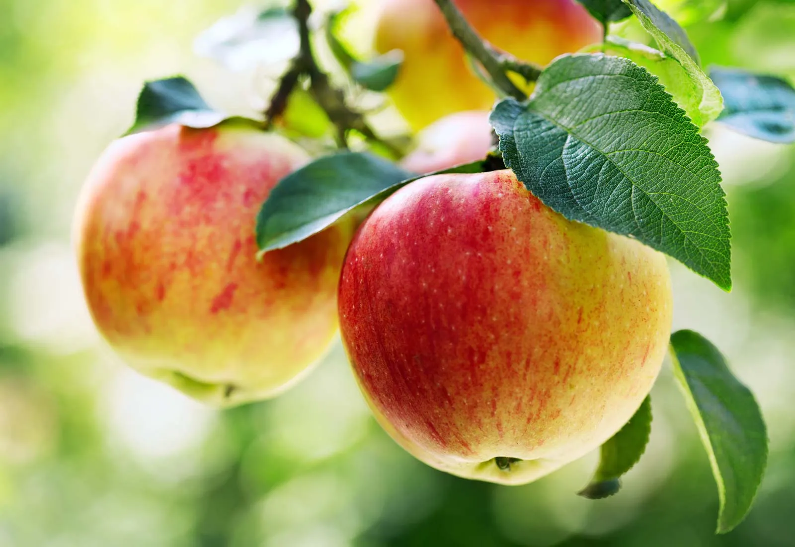
Click the image to zoom in.
When isDisabled is set, the expand icon is hidden and clicking the image does nothing.
Use zoomMargin to keep a pixel gap between the zoomed image and the viewport edges.
Provide a zoomSrc to display a higher-resolution image when zoomed, while keeping a smaller thumbnail in the page.
Override the default accessible labels with expandButtonAriaLabel and unzoomButtonAriaLabel.
- The trigger wrapper has
role="button"andtabindex="0", so it is reachable by keyboard. - Press
EnterorSpaceto zoom; pressEscapeto close. - Focus moves to the close button when the dialog opens and returns to the trigger when it closes.
- The expand and close buttons have configurable
aria-labelvalues viaexpandButtonAriaLabelandunzoomButtonAriaLabel. - The component uses a native
<dialog>element, which is automatically exposed to assistive technologies as a modal.
import { DapDSImageZoom } from 'dap-design-system'
import { DapDSImageZoomReact } from 'dap-design-system/react'
For optimal bundle sizes, use the tree-shakeable import syntax:
import { DapDSImageZoom } from 'dap-design-system/components'
| Property | Type | Default | Description |
|---|---|---|---|
open | boolean | false | The open/zoomed state. Can be used for controlled mode. |
isDisabled | boolean | false | Disables zoom functionality. |
zoomMargin | number | 0 | Margin in pixels from viewport edges when zoomed. Default is 0. |
expandButtonAriaLabel | string | null | Accessible label for the zoom trigger. Default is 'Expand image'. |
unzoomButtonAriaLabel | string | null | Accessible label for the unzoom button. Default is 'Minimize image'. |
canSwipeToUnzoom | boolean | true | Enables swipe gesture to close when zoomed. Default is true. |
swipeToUnzoomThreshold | number | 10 | Swipe distance in pixels required to trigger unzoom. Default is 10. |
zoomSrc | string | URL of a higher quality image to display when zoomed. Falls back to the slotted image src. | |
hideButtons | boolean | false | Hides the expand and unzoom buttons. Default is false. |
zoomButtonVariant | ButtonVariant | 'primary' |
| Name | Description |
|---|---|
(default) | The image or content element to zoom. Should contain an <img> element. |
| Event Name | Description | Type |
|---|---|---|
dds-zoom | Fires when the image is about to zoom. Cancelable via event.preventDefault(). | CustomEvent |
dds-unzoom | Fires after the image has unzoomed. | CustomEvent |
| Part Name | Description |
|---|---|
trigger | The zoom trigger wrapper element. |
dialog | The zoom dialog element. |
overlay | The backdrop overlay element. |
zoomed-image | The zoomed image element. |
unzoom-button | The button to close the zoomed view. |
expand-button | The button to expand the image. |
expand-button-base | The base of the expand button. |
expand-button-content | The content of the expand button. |
unzoom-button-base | The base of the unzoom button. |
unzoom-button-content | The content of the unzoom button. |
expand-button-icon | The icon of the expand button. |
unzoom-button-icon | The icon of the unzoom button. |
You can style CSS parts using the ::part() pseudo-element selector:
/* Target a specific part */
.my-custom-dap-ds-image-zoom::part(trigger) {
  /* Your custom styles */
}

/* Target multiple parts */
.my-custom-dap-ds-image-zoom::part(trigger),
.my-custom-dap-ds-image-zoom::part(dialog) {
  /* Shared styles */
}
Example usage:
<dap-ds-image-zoom class="my-custom-dap-ds-image-zoom">
  Image zoom
</dap-ds-image-zoom>
.my-custom-dap-ds-image-zoom::part(trigger) {
  border-radius: 12px;
  box-shadow: 0 2px 8px rgba(0, 0, 0, 0.1);
}
CSS parts allow you to style internal elements of the component while maintaining encapsulation. Learn more in our styling guide.
| Property Name | Description |
|---|---|
--dds-image-zoom-overlay-bg | Overlay background color (default: rgba(0, 0, 0, 0.8)). |
--dds-image-zoom-transition-speed | Animation duration (default: 300ms). |
--dds-image-zoom-transition-timing | Animation timing function (default: var(--dds-easing-ease-in-out, ease-in-out)). |
CSS custom properties (CSS variables) can be set directly on the component or in your stylesheet:
Method 1: Inline styles (Quick customization)
<dap-ds-image-zoom
  style="--dds-image-zoom-overlay-bg: value; --dds-image-zoom-transition-speed: value;">
  Image zoom
</dap-ds-image-zoom>
Method 2: CSS classes (Reusable styles)
.my-custom-dap-ds-image-zoom {
  --dds-image-zoom-overlay-bg: value;
  --dds-image-zoom-transition-speed: value;
  --dds-image-zoom-transition-timing: value;
}
<dap-ds-image-zoom class="my-custom-dap-ds-image-zoom">
  Image zoom
</dap-ds-image-zoom>
Method 3: Global theme customization
/* Apply to all instances */
dap-ds-image-zoom {
  --dds-image-zoom-overlay-bg: value;
  --dds-image-zoom-transition-speed: value;
}
CSS custom properties inherit through the Shadow DOM, making them perfect for theming. Changes apply immediately without rebuilding.